Internet Explorer Conditional Comments

last update : 17 Januray 2012

Many web designers use browser detection techniques to ensure that their sites display properly when viewed with specific browsers. Often Internet Explorer prior to version 9 is focused by developers because of bugs or lack of support of new css features. The most common way to detect Internet Explorer is to use client-side scripting to parse the user-agent string and extract the version number from the version token. If one is specifically interested in Internet Explorer, conditional comments might be a more effective alternative.

Conditional comments are a simple Internet-Explorer-only feature that Microsoft added to IE5 Windows and later. They provide an easy way to detect what IE browser a visitor is using to serve him different blocks of HTML.

There are two types of conditional comment: downlevel-hidden and downlevel-revealed. Downlevel-hidden comments hide HTML from non-IE browsers and from down-level IE browsers. The basic syntax of a downlevel-hidden conditional comment is :

<!--[if expression]> HTML <![endif]-->

expression can contain a number of different operators and values.

The downlevel-revealed conditional comment enables you to include content in browsers that do not recognize conditional comments. The basic syntax is :

<![if expression]> HTML <![endif]>

Conditional comments are usually used to load specific css or javascript files.

Conditional comments produce valid W3C code.

More informations about these topics :

MotionPortrait

MotionPortrait Inc is an japanese entertainment solution company that creates “Surprise and Impression” pursuing technology and creativity.

You can apply MotionPortrait as web sales promotion tools in various business scenes with its realistic expression, easy operation and low installation cost.  MotionPortrait provides its technology for various platforms such as mobile phones, the web and game consoles.

The most exciting applications for mobile phones (iOS, Android, …) are :

  • PhotoSpeak : 3D Talking Photo
  • 3D Animalizer : transforms you and your friends into 3D animals
  • uMovie : movies starring YOU
  • MillionFace : takes a single portrait photo and transforms it into over a million face variations in a 3D interactive movie

Viewports for mobile devices and tablet PC’s : a pixel is not a pixel

Last update : June 24, 2014

Designing a webpage which looks good on desktop PC’s, mobile devices and tablet PC’s is challenging. You have to optimize your content at least for screens that are 320px, 480px, 768px, and 1024px wide. One tool to reach this goal is the viewport meta tag.

The viewport meta tag was introduced by Apple for the iPhone, and it has since been picked up by Microsoft for Windows Mobile, by Nokia for Maemo and by Android. Remember however that the viewport has nothing to do with the device. The viewport is the browser and more precisely the window of the browser. Recently the W3C published a draft of a CSS Device Adaptation based on the viewport meta tag.

The tag is ignored by regular desktop browsers.

<meta name="viewport" content="width=800" />

Mobile Safari presents desktop-sized websites on small screens by rendering to a virtual browser screen that is 980 pixels wide. Opera assumes a page to be 850 pixels wide. Pages on the iPad in portrait mode and on other mobile devices are scaled down.  Pages can be zoomed and panned. Viewport tags tell the Mobile Safari that the website displays properly narrower than 980 pixels. The webpage can be set for other scaling preferences.

Apple suggests to avoid hard-coding a width for the viewport and to use the physical device-width to set the viewport :

<meta name="viewport" content="width=device-width" />

This setting makes one CSS pixel equal to one device pixel. The physical device-width refers to the screen size in portrait mode. One problem is that the content is blowed up if the device is oriented in landscape mode. To avoid blow-up, a maximum scale factor can be applied :

<meta name="viewport" content="width=device-width, maximum-scale=1.0" />

You can add the attribute “user-scalable=no” to disable the pinch-to-zoom feature :

<meta name="viewport" content="width=device-width, user-scalable=no" />

This is useful for preventing accidental zooms and makes web apps feel more app-like, but most users might want to see the content at a larger size.

The complete list of viewport properties for iPad (and iPhone with Retina display) is given below :

  • width : 200 – 10.000 ; default : 980
  • height : 223 – 10.000
  • minimum-scale : 0.0 – 10.0 ; default : 0.25
  • maximum scale : 0.0 – 10.0 ; default : 1.6
  • initial-scale : between min and max
  • user-scalable : yes / no ; default : yes

To hide the control-bar which consumes about 60 pixels, the following script can be used :

<body onload="setTimeout(function() { window.scrollTo(0, 1) }, 100);"></body>

To deal with the greatly differing screen sizes, CSS media queries allow to specify completely different stylesheets depending on how large the screen is.

<link media="only screen and (max-device-width: 480px)" href="small.css" type= "text/css" rel="stylesheet">
<link media="only screen and (min-device-width: 481px) and (max-device-width: 1024px)" href="medium.css" type="text/css" rel="stylesheet">
<link media="screen and (min-device-width: 1025px)" href="large.css" type="text/css" rel="stylesheet">

Instead of using separate css-files, the media query can be used inside a single css-file :

@media only screen and (min-device-width: 481px) and (max-device-width: 1024px)
{
styles
}

In fact it’s useful to consider two viewports : one based on device pixels, the other based on CSS pixels. Only at zoom level 100% one CSS pixel is exactly equal to one device pixel.

The iPhone 4’s Retina display has a far larger physical pixel density than previous iPhones. Still, it reports 320px for the device-width media query (as well as JavaScript screen.width) both with and without the meta viewport width=device-width.

A few links about useful tutorials about viewports and other related subjects are listed herafter :

The next list shows links to iPad and iPhone simulators to test the rendering of webpages on these devices :

Facebook URL Linter and Insights

The Facebook URL linter is a tool that helps you to debug Open Graph webpages, pages with embedded like button or with other social plugins.

The Open Graph Protocol Open Source Community developped other tools and parsers for php, java, python, ruby, json to check Open Graph webpages.

It’s even possible to see how many URL’s of pages that are not part of the Facebook Open Graph have been shared by using the API request :

http://graph.facebook.com/?id=http://www.example.com

More details are provided by the API request

https://api.facebook.com/method/fql.query?query=SELECT%20share_count,%20like_count,%20comment_count,%20total_count,%20click_count%20
FROM%20link_stat%20WHERE%20url=%27http://www.example.com/%27

Insights provides analytics on a Facebook Page, app and website. The Insights Dashboard makes it easy to see how Facebook users are interacting with your content, and the Insights APIs allow developers to obtain additional statistics and integrate the data with third party reporting systems.

Valid W3C websites with Facebook Open Graphs or Like Buttons

last update : December 23, 2011
A developer who added Facebook Open Graph metatags or Like Buttons to his webpage finds a lot of error messages (invalid HTML/XHTML) in the W3C Validator. This means it won’t work on a lot of browsers.

Several fixes exist to make the webpages W3C compliant. A few useful links will be given below:

Google Apps Engine Tips

Rollback

If an update for GAE (Google App Engine) doesn’t complete it will cause an error (similar to : Another transaction by user xxxx  is already in progress for this app and major version. That user can undo the transaction with appcfg.py’s “rollback” command.) and not allow you to upload new updates. The rollback can de done with a batch file. A faster solution to fix this problem is incrementing the version number in the app.yaml file and activating the new version in the online console. The same error arise if you want to delete an a app with failed update. The only solution in this case is to do the rollback.

Google App Engine (GAE)

Google App Engine

GAE (Google App Engine) is a platform for developing and hosting web applications in Google-managed data centers. It was first released as a beta version in April 2008. GAE is cloud computing technology. It virtualizes applications across multiple servers and data centers. GAE is Platform as a Service while AWS (Amazon Web Services) is Infrastructure as a Service.

GAE is free up to a certain level of used resources. Fees are charged for additional storage, bandwidth, or CPU cycles required by the application.

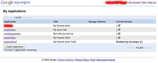
The applications of the logged Google developer are available at https://appengine.google.com/

List of GAE applications

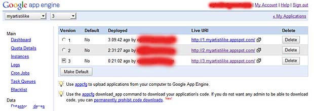
The dashboard allows to manage the different applications (quotas, instances, logs, cron jobs, task queues, blacklists, datastore, blob viewer, settings, permissions, billing, resources, …). A very efficient feature is the version control based on the app.yaml file :

GAE version control

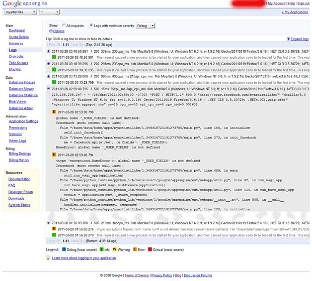
Another useful feature is the error logging :

GAE error logging reports