
Last update : July 5, 2014
Jason Grigsby outlined two years ago that there are two separate, but related requirements that need to be addressed regarding the use of the <img> element in responsive designs :
- enable authors to provide different resolutions of images based on different environmental conditions
- enable authors to display different images under different conditions based on art direction
Resolution Switching
When we handle an image for Retina displays, it makes sense to deliver a crispy, high resolution picture to the browser. When we send the same image to a mobile with a small screen or to a tablet connected with low speed, it’s efficient to save bandwidth and to reduce the loading and processing time by providing a small size picture.
In HTML, a browser’s environmental conditions are primarily expressed as CSS media features (orientation, max-width, pixel-density, …) and CSS media types (screen, print, …). Most media features are dynamic (a browser window is resized, a device is rotated, …). Thus a browser constantly responds to events that change the properties of the media features. Swapping images provides a mean to continue communication effectively as the media features change dynamically.
Art Direction
When we display an image about a subject (i.e. the brain structure) at a large size, it makes sense to show the context. When we display the same image on a small screen, it’s useful to crop it and to focus on a detail. This differentiation is ruled by art direction.

for small screens a detail looks better than the resized original (Wikipedia) picture
Breakpoints
The @media query inside CSS or the media tag inside the link element are the key ingredients for responsive design. There are several tactics for deciding where to put breakpoints (tweak points, optimization points). As there are no common screen sizes, it doesn’t make sense to base the breakpoints on a particular screen size. A better idea is to look at the classic readability theory and to break the layout if the width of a column exceeds 75 characters or 10 words. These are the breakpoints. Vasilis van Gemert created a simple sliding tool to show the impact of language and font family on the text width.
Lucky responsive techniques
In the recent past, web developers relied on various techniques (CSS background images, Javascript libraries, semantically neutral elements, <base> tag switching, …) to use responsive images in their applications. All of these techniques have significant limits and disadvantages (bypassing the browser’s preload scan, redundant HTTP requests, complexity, high processing time, …). For all these reasons a standardized solution was wanted.
Possible responsive image solutions
The proposed solutions to deal with one or with both of the requirements for responsive images (“resolution switching” and “art-direction“) are the following :
- <picture> element : addresses requirement #2 (the author selects the image series and specifies the display rules for the browser)
- srcset and sizes attributes : addresses requirement #1 (the browser selects the image resolution based on informations provided by the author)
- CSS4 image-set : addresses requirement #1 (the browser selects the images based on informations provided by the author)
- HTTP2 client hints : addresses requirements #1 and #2 (the server select the images based on rules specified by the author)
- new image format : addresses requirement #1 (there is only one image)
Responsive image standardization
On June 20, 2014, Anselm Hannemann, a freelance front-end developer from Germany, announced on his blog that the <picture> element and the attributes srcset and sizes are now web standards. The discussions and debates about the specification of a native responsive images solution in HTML lasted more than 3 years inside WHATWG, RICG and W3C.
The Responsive Images Community Group (RICG) is a group of developers working towards a client-side solution for delivering alternate image data based on device capabilities to prevent wasted bandwidth and optimize display for both screen and print. RICG is a community group of the World Wide Web Consortium (W3C). The group is chaired by Mathew Marquis of the Filament Group and has 362 participants, among them the Responsive Web Design pioneers Nicolas Gallagher, Bruce Lawson, Jason Grigsby, Scott Jehl, Matt Wilcox and Anselm Hannemann.
The RICG drafted a picture specification (editors draft July 1, 2014) with the new HTML5 <picture> element and the srcset and sizes attributes that extends the img and source elements to allow authors to declaratively control or give hints to the user agent about which image resource to use, based on the screen pixel density, viewport size, image format, and other factors.
Bruce Lawson was the first to propose the <picture> element and he has a degree of attachment to it. The srcset attribute was presented on the WHATWG mailing list by someone from Apple. At first, the majority of developers favored the <picture> element and the majority of implementors favored the srcset attribute. The W3C states how the priority should be given when determining standards:
In case of conflict, consider users over authors over implementors over specifiers over theoretical purity.
Both WHATWG and W3C included now the <picture> element and the srcset and sizes attributes to the HTML5 specification. The links are given below :
The <picture> element
The use of the <picture> element is shown in the following code examples :
<picture>
 <source srcset="brain-mobile.jpg, brain-mobile-x.jpg 2x">
 <source media="(min-width: 480px)" srcset="brain-tablet.jpg,
    brain-tablet-hd.jpg 2x">
 <source media="(min-width: 1024px)" srcset="brain-desktop.jpg,
    brain-desktop-hd.jpg 2x">
 <img src="brain.jpg" alt="Brain Structure">
</picture>
With a mobile-first approach, the image “brain-mobile.jpg” is rendered by default, the image “brain-tablet.jpg” is rendered if the user screen is at least 480px wide, and “brain-desktop.jpg” is rendered if the user screen is at least 1024px wide. The image “brain.jpg” is destinated to those browsers who don’t understand the <picture> element. The second URL in the srcset attribute is paired with the string 2x, separated by a space, that targets users with a high-resolution display (like the Retina with a pixel density 2x).
<picture>
<source sizes="100%" srcset="brain-mobile.jpg 480w,
brain-tablet.jpg 768w, brain-desktop.png 1024w">
<img src="brain.jpg" alt="Brain Structure">
</picture>
In the second example the sizes attribute is used to let the image cover all the width of the device (100%), regardless of its actual size and pixel density. The browser will automatically calculate the effective pixel density of the image and choose which one to download accordingly.
The four images brain-mobile.jpg, brain.jpg, brain-tablet.jpg and brain-desktop.jpg not only have different dimensions, but may also have different content. This way authors are enabled to display different images under different conditions, based on art direction.
The <picture> element should not be confused with the HTML5 <figure> element which represents some flow content. The <figure> element is able to have a caption, typically the <figcaption> element.
<figure>
   <figcaption>Brain Structure</figcaption>
   <img src="brain.jpg" alt="Brain Structure" width="320"/>
</figure>
The sizes syntax is used to define the size of the image across a number of breakpoints. srcset then defines an array of images and their inherent sizes.
The srcset attribute
The srcset is a new attribute for use in the <img> elements. Its value is a comma separated list of images for the browser to choose from. An simple example is shown below :
<img srcset="brain-low-res.jpg 1x, brain-hi-res 2x, width="320"
alt="Brain Structure">
We tell the browser that there is an image to be rendered at 320 CSS pixels wide. If the device has a normal 1x screen, a low resolution image 320 x 240 pixels is loaded. I the device has a pixel ratio of 2 or more, a higher resolution image 640 x 480 pixels is requested from the server by the browser.
Here comes a second example :
<img src="brain.jpg" sizes="75vw"
srcset="brain-small.jpg 320w, brain-medium.jpg 640w,
brain-large.jpg 1024w,brain-xlarge.jpg 2000w"
alt="Brain Structure">
The srcset attribute tells the browser which images are available with their respective pixel widths. It’s up to the browser to figure out which image to load, depending on the viewport width, the pixel ratio, the network speed or anything else the browser feels is relevant.
The sizes attribute tells the browser that the image should be displayed at 75% of the viewport width. The sizes attribute is however more powerful than indicating default length values. The format is :
sizes="[media query] [length], [media query] [length] ... etc"Media queries are paired with lengths. Lengths can be absolute (pixel, em) or relative (vw). The next exampe shows a use-case:
<img src="brain.jpg"
sizes="(min-width:20em) 240px,(min-width:48em) 80vw, 65vw"
srcset="brain-small.jpg 320w, brain-medium.jpg 640w,
brain-large.jpg 1024w,brain-xlarge.jpg 2000w"
alt="Brain Structure">
We tell the browser that in viewports between 0 and 20 em wide the image should be displayed 240 pixels wide, in viewports between 20 em and 48 em wide the image should take up 80% of the viewport and in larger viewports the image should be 65% wide.
Can I use responsive images ?
The support of the <picture> element and the srcset and sizes attributes in the various browsers can be checked at the “Can I Use” website. This site was built and is managed by Alexis Deveria, it provides up-to-date support tables of front-end web technologies on desktop and mobile browsers.
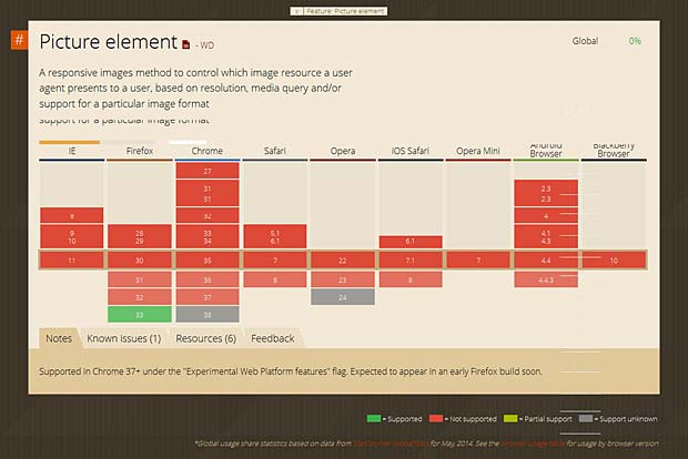
Support of the picture element in browsers (Can I Use Website)
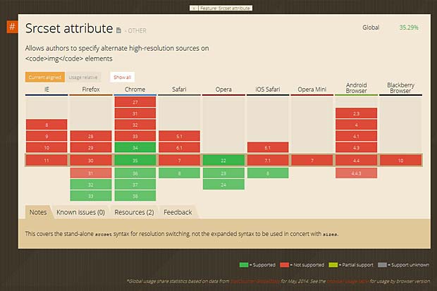
Support of the srcset attribute in browsers (Can I User Website)
Actually the <picture> element is only supported by Firefox version 33. The srcset attribute is only supported by Firefox versions >32, Chrome versions > 34, Safari version 8 and Opera versions > 22.
PictureFill
The poor support of the <picture> element and the srcset attribute in actual browsers does not mean that you have to wait before implementing responsive images in your website. Scott Jehl from Filament Group developped a great polyfill called PictureFill supporting the <picture> element and the srcset and sizes attributes.
Initialization code :
<script>
// Picture element HTML5 shiv
document.createElement( "picture" );
</script>
<script src="picturefill.js" async></script>
<picture> code :
<picture>
<!--[if IE 9]><video style="display: none;"><![endif]-->
<source srcset="brain-xx.jpg" media="(min-width: 1000px)">
<source srcset="brain-x.jpg" media="(min-width: 800px)">
<source srcset="brain.jpg">
<!--[if IE 9]></video><![endif]-->
<img srcset="brain.jpg" alt="Brain Structure">
</picture>
If JavaScript is disabled, PictureFill only offers alt text as a fallback. PictureFill supports SVG and WebP types on any source element, and will disregard a source if its type is not supported. To support IE9, a video element is wrapped around the source elements using conditional comments.scrset code :
<img sizes="(min-width: 40em) 80vw, 100vw"
srcset="brain-s.jpg 375w,brain.jpg 480w,brain-x.jpg 768w"
alt="Brain Structure">
The PictureFill syntax is not quite the same as the specification. The fallback src attribute was intentionally removed to prevent images from being downloaded twice.
CSS4 image-set
By using the CSS4 image-set function, we can insert multiple images which will be set for normal and high-resolution displays. The image-set function is declared within the background-image property, while the background URL is added within the function followed by the resolution parameter (1x for normal display and 2x is for high-res display), like so :
.selector {
 background-image: image-set(url('image-1x.jpg') 1x,
 url('image-2x.jpg') 2x);
}
The CSS4 image-set function is also trying to deliver the most appropriate image resolution based on the connection speed. So, regardless of the screen resolution, if the user accesses the image through a slow Internet connection, the smaller-sized image will be delivered.
CSS4 image-set is still experimental. It is only supported in Safari 6 and Google Chrome 21 where it is prefixed with -webkit.
HTTP2 client hints
The responsive image standards leave the burden to create images at appropriate sizes, resolutions and formats to the web developer. Client hints are a way to offload this work to the server. Client hints are HTTP headers that give the server some information about the device and the requested resource. Ilya Grigorik, web performance engineer and developer advocate at Google, submitted in December 2013 an Internet Draft “HTTP client hints” to the Internet Network Working Group of the Internet Engineering Task Force (IETF). The draft specifies two new headers for the HTTP 2.0 version : CH-DPR for device pixel ratio and CH-RW for resource width. A server-side script will generate the best image for the requesting device and deliver it.
New image formats
There are some new image formats like JPEG2000, JPEG XR and WebP that generate higher quality images with smaller file sizes, but they aren’t widely supported. JPEG 2000 is scalable in nature, meaning that it can be decoded in a number of ways. By truncating the codestream at any point, one may obtain a representation of the image at a lower resolution. But the web already has this type of responsive image format, which is progressive JPEG, if we get the browsers to download only the neccesary bytes of the picture (i.e. with the byte range HTTP header). The main problem is that the new image formats will take long to implement and deploy, and will have no fallback for older browsers.
Links
The following list provides links to websites with additional informations about <picture>, srcset, PictureFill and related topics :
- Picturefill 2.0: Responsive Images And The Perfect Polyfill, by Tim Wright
- Srcset and sizes, by Eric Portis
- Responsive Images Done Right: A Guide To picture And srcset, by Eric Portis
- The new srcset and sizes explained, by Martin Wolf
- Responsive IMGs: Choosing between semantic markup and working code, by Jason Grigsby
- Picturefill, by Scott Jehl
- Responsive Image Container, by Yoav Weiss
- Responsive Image Format, by Yoav Weiss
- Use Cases and Requirements for Standardizing Responsive Images, W3C Working Group Note November 2013
- Responsive Images: How they Almost Worked and What We Need, by Mat Marquis
- Responsive Images and Web Standards at the Turning Point, by Mat Marquis
- WTFWG, by Tim Kadlec
- Better Responsive Images With the picture Element, by Aurelio De Rosa
- HTTP client hints, by Ilya Grigorik
- HTTP2 & client hints, by Justin Avery
- Why we need client hints in HTTP2, by Yehia Elkhatib
- Responsive images, by Derek Johnson
- Responsive Images: What We Thought We Needed, by Paul Lloyd
- Retina Revolution, by Daan Jobsis
- The ideal bitmap image size can only be determined by the browser at runtime, by Le Roux Bodenstein
- Going Atomic for better #highered responsive websites?, by Karine Joly
- Responsive Web Design, most complete guide (2011), by WebDesignShock/li>
- The 2014 Guide to Responsive Web Design, by Nick Pettit
- Responsive Images using and srcset/sizes, by Matt Steele
- Logical breakpoints for your responsive design, by Vasilis van Gemert
- screensiz.es : listing of device resolutions
- mediaqueri.es, by Eivind Uggedal (a collection of inspirational websites using media queries and responsive web design)

