FeedBurner

FeedBurner is a Chicago-based company that provides media distribution and audience engagement services for blogs and RSS feeds. Its Web-based tools, including an extensive feed and blog advertising network, help publishers promote, deliver, and monetize their content on the Web and make feed-based content more accessible and manageable for its end users. In 2007, FeedBurner was acquired by Google.

A FeedBurner Blog is available at the Google website. FeedBurner Stats is Google’s analytics offering for blogs, websites and feeds of all kinds. The service is free with every FeedBurner feed and provides publishers with a comprehensive view of their audience.

The FeedBurner Stats service for feeds provides the following feed-related information:

  • Subscription data (e.g. number of subscribers by day, previous week, last 30 days and all time) and Reach data (the estimated number of individuals clicking or viewing your feed content in a given day)
  • Breakdown of feed readers and aggregators, email services, web browsers and bots by which subscribers are accessing your content
  • Clickthrough tracking
  • Uncommon uses — sites where your content has been resyndicated including other blogs, directories and even spam sites
  • Item enclosure downloads (podcasts)
  • Live hits, conveniently translated to your local time zone

For even more insight, you can activate the following PRO features for no charge:

  • Reach
  • Item views

Today I activated FeedBurner for my Blog.

(http://feeds2.feedburner.com/InteractiveRichMedia)

RSS feeds about contemporary arts

I assembled the following list of handselected rss-feeds about contemporary art :

Luxembourg News :

Integrate rss feeds in a webpage

Last update : December 28, 2011
To integrate rss (Really Simple Syndication) feeds in a webpage, different technical solutions are available.

XSL Transformations

rss feeds are xml documents. To transform xml documents into another format like XHTML or HTML, XSL Transformations (XSLT) are used. XSL stands for Extensible Stylesheet Language. I tried this technique in 2006 with the artpet.lu website and I run into several problems with browser incompatibilities needing browser specific code selectors in the related javascript file.

Javascript widgets

A second possibility is to use a Javascript widget displaying the parsed rss data provided by a third party rss to HTML service.

The following list shows a few rss to javascript providers :

Flash Widgets

Some rss  to HTML providers offer Flash widgets to display the parsed rss data.

PHP

PHP coupled up with HTML is the favored method for showing RSS feeds on a website when it comes to search engine optimization.

Among the php scripts, Magpie RSS, published by Kellan Elliot-Mcrea under a GPL licence, is widely considered to be the most robust option, with SimplePie coming as a second best with the less restrictive BSD license and a few additional features. SimplePie is a fast and easy to use PHP library for parsing RSS and Atom, written by Ryan Parman and Geoffrey Sneddon. There are a number of alternative RSS-Libraries for PHP, including lastRSS.php, PEAR::XML_Feed_Parser, PEAR::XML_RSS, rss2array and PHP RSS News Parser.

I installed SimplePie on my hosted webserver a few years ago. The provided testscript to ensure that the basic requirements have been addressed by the server and that you have everything you need to run SimplePie properly is very helpful.

simplepie

simplepie

I use the php technique at the www.lesliesartgallery.eu website.

Late 2011, I prefer the Google Feed API solution to quickly integrate feeds on my websites.

Google Website Optimizer

Google recently launched the Website Optimizer, a tool that can help you improve the effectiveness of your website by allowing you to test different versions of your site content to determine what will best attract users.

Website Optimizer uses two types of testing: A/B testing and multivariate testing.

An A/B experiment allows you to test the performance of two (or more!) entirely different versions of a page. You can change the content of a page, alter the look and feel, or move around the layout of your alternate pages; there’s plenty of design freedom with A/B testing.

Multivariate tests, on the other hand, allow you to test multiple variables — in this case, sections of a page — simultaneously. For example, you could identify the headline, image, and promo text as parts of your page you’d like to improve, and try out three different versions of each one.

A/B experiments are the simpler version of testing with Website Optimizer. Experiments can run on many webpages of a website.

Website Optimizer needs a Google Analytics Account, because it uses the same powerful tracking technology that is used in Google Analytics to collect experiment data. The performance of experiment pages won’t be impacted, with the possible exception of the very first page-load after you have added the tracking code.

A quick start guide is available at the Google site. Different test strategies are possible (time on page,  conversions, clicking rates, landing pages, …).

Website Optimizer scripts will fail W3C validation because they meet browser requirements which do not strictly adhere to the W3C guidelines. There is no workaround available for these errors.

Understanding Google Analytics

During the creation of a new website, I was able to have a closer look on the internal working of Google Analytics. Four computers were used to test the first layout of the new website connected to three different IP adresses. The setup was the following :

  • PC 1 : Windows XP, screen resolution 1024 x 768, three browsers : IE 8.0.6001, Firefox 3.08, Chrome 1.0.154.153
  • PC 2 : Windows XP, screen resolution 1024 x 768, three browsers : IE, Firefox, Chrome
  • PC 3 : Windows XP, screen resolution 1280 x 1024, browser IE
  • PC 4 : Windows Vista, screen resolution 1280 x 800, browser IE

Google Analytics reported 18 visits from 8 unique visitors during two days, which is correct if every used browser is considered as a unique visitor (use of cookies). The reported screen resolutions, operating systems, browser versions and flash versions were correct.

The unique pageviews can not be higher than the total number of unique visitors, which was the case. The 18 visits were segmented in 8 visits from new visitors and 10 visits from returning customers.

Customer loyalty

Customer loyalty

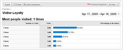
In the visitor loyalty report, the visits were indicated as :

  • 1 times : 8
  • 2 times : 5
  • 3 times : 3
  • 4 times : 1
  • 5 times : 1

Web Design : block and inline elements

Block elements take up the full width of the page and are naturally displayed on a new line. Block elements can not be nested within inline elements.

Examples of block elements :

  • <div>
  • <h1> … <h6>
  • <p>
  • <table>
  • <ul>, <ol>, <dl>
  • <li>, <dt>, <dd>
  • <form>

Inline elements only take up as much width as is required to display the element and will not force a new line. A width or height will not displayed on an inline element.

Examples of inline elements :

  • <span>
  • <img>
  • <a>
  • <strong>
  • <em>

With the CSS command “display: inline” block elements can be altered to behave as inline elements. By floating these elements, it will give the appearance of an inline element  but will also allow you to style them as if they were block elements. Therefore width and height can be applied to float’s successfully irrespective of whether the element has a default display of block or inline which is the reason why float’s are used so much in web design.

Target audience for an artgallery website

In marketing and advertising, a target audience, or target group is the primary group of people that something, usually an advertising campaign, is aimed at appealing to. The same rules apply for a website. The target audience for the website of an artgallery are art collectors, artists and art lovers.

To design a new website tailored to the preferences of this target audience, you have to identify the profile of these people, which is not an easy task. A first approach is to analyse the profile of the visitors of the old website, assuming that it reflects the typical profile of the target audience.

The following data sources can be explored to get useful informations :

  • Google Analytics (if installed on the website)
  • Alexa (web traffic metrics)
  • Quantcast

The Google Analytics report for an artgallery website, operational since more than 3 years, provides data from more than 4 million pageviews, 3 million visits and 2.3 million unique visitors, which is quite impressive and representative.

The  results from the analysis for the browser capabilities are the following:

Browser types:

  • IE : 75,6%
  • Firefox : 18,2%
  • Safari : 5,1%
  • others: 1,1%

Operating Systems:

  • Windows : 91,8%
  • MacIntosh: 7,5%
  • Linux: 0,5%
  • others: 0,2%

Screen Resolutions:

  • lower or equal 800 pixel horizontal: 7,2%
  • 1024 x 768 pixel: 43,5%
  • higher or equal 1152 pixel horizontal: 49,3%

Flash support:

  • Flash 10: 20% (augmenté à 40% les trois derniers mois)
  • Flash 9: 64,4%
  • Flash 8 or less: 15,6%

Java support:

  • yes: 98,3%
  • no: 1,7%

Traffic sources :

  • Direct traffic : 58,2%
  • Refering sites : 40,1%
  • Search Engines : 1,1%

Key search terms : women in art, artgallery, digital art

Number of recurring visitors (more than 9 visits in 3 years): 31.326

Number of very loyal visitors (more than 200 visits in 3 years) : 2.891

The Web Information Company Alexa provides the following metrics (Demographics) for the website:

  • Age : Relative to the general internet population, 55-64 year olds are greatly over-represente
  • Gender : Relative to the general internet population, Females are over-represente
  • Education : Relative to the general internet population, people who went to graduate school are over-represented
  • Location :  Relative to the general internet population, people browsing from home are over-represented
  • Key search terms :  video,  alice, women in art, digital art

Quantcast provides following informations : This site reaches approximately 12,614 U.S. monthly people. The site attracts a 50+, somewhat wealthy, rather female, more educated group.

Web Design : layout’s with rounded corners

last update : 18 August 2011

In the past it was impossible to create any kind of curved shapes using pure HTML. There were three methods to generate layouts with rounded corners :

  • CSS
  • Javascript
  • Images

There were a lot of tutorials available on the net how to create rounded corners with CSS. A simple way to generate the CSS and HTML you need to create anti-aliased corners without using images or javascript was the online tool Spiffy Corners from Greg Johnson.

One of the first creators of CSS layouts with rounded corners was Alessandro Fulciniti. He improved his Nifty Corners technique by adding Javascript.

Both methods didn’t work as expected on elements with fixed height, even if a external wrapper was applied. For this reason I preferred the image method with four corner images. Douglas Livingston‘s demo-page show a simple way how to do it (creative commons license). Another useful tutorial about rounded corners has been published by Trenton Moss, complete overviews of techniques are available at CSSjuice and Smileycat.

With HTML 5 and CSS3, the described techniques have become obsolete. CSS3 supports native rounded corners.

Flexible Web Design: web-page width

Last update : June 24, 2014

Web-page layouts can be grouped into four categories based on how their width is set: fixed-width, fluid (or liquid), elastic and hybrid. Creating web pages without fixed-width is considered as flexible web design.

The width of the overall layout of a fixed-width design is set to a value in pixels that’s decided by the designer, based on common screen resolutions, such as 800 by 600 or 1024 by 768. A recommended page width for 1024 by 768 pixel screens is 960, which is divisible by many numbers (2, 3, 4, 5, 6 and multiples). Fixed-width designs are rigid: they don’t change size based on any variations in the user’s setup. Because some people don’t browse with their browser window maximized, the screen resolution doesn’t match the browser window width all the time. Fixed-width designs are always going to result in some segment of the audience seeing a design that is either too wide for their windows (necessitating the dreaded horizontal scrolling) or too narrow (leaving oceans of space on one or both sides of the layout). Many people get almost as distressed about “wasted space” in their browser as they do about horizontal scrolling.

Fluid layouts, also known as liquid layouts, change in width based on the size of the user’s viewport (the viewable area of a page in the user’s device). If fluid layouts don’t have a width assigned with CSS, they will fill up the user’s viewport no matter how big or small it is. If a designer does assign a width to a fluid layout, it will be measured in percentages, not in pixels. The percentage refers to the portion of the viewport it takes up. When a fluid layout changes in size, all of the content within it has to shift around on the page to fill up the space. Horizontal scrollbars are the sworn enemy of readability. After all, scrolling continually back and forth to read across several lines of text does not make for the most enjoyable reading experience. With a liquid layout, horizontal scrollbars almost never happen, because users can size the window however they like to produce lines of text that they find the most comfortable to read and understand.

Elastic layouts change in width based on the text size set in the user’s browsing device. A user who has set a larger default text size will see a page where not only is the text bigger, but the entire layout is bigger proportionally than that seen by people with the default text size. Like fixed-width layouts, elastic layouts always have a width assigned to them, but that width is set in a unit of measurement called an em. One em is equal to the font height, which in turn equals roughly two characters in width, since most characters aren’t nearly as wide as they are tall. Elastic layouts are the rarest type of layout because before CSS became usable for page layout, they were simply impossible to create with tables. In many browsers, you can use the zoom feature to make all pages act like elastic layouts, which reduce the interest to use real elastic layouts.

Most web layouts are built using the idea of columns, whether or not the columns are explicitly visible in the design. Each column can have its own unit of measurement and be thought of individually as fixed-width, fluid or elastic. Mix them together, and you’ve got a hybrid layout. For example, a common type of hybrid layout has a fixed-width sidebar with a liquid main content area.

A resolution-dependent layout is a page that uses JavaScript to switch the CSS and thus the layout of the elements on the page by detecting browser window size. The CSS properties min-width and max-width allow you to set limits on how far a flexible layout will expand or contract.

More informations are available at the Peachpit website and at baekdal.com.