Responsive, adaptive and reactive web design

Last update : June 25, 2014

Responsive web design is creating web layouts that can adapt to a multitude of displays and devices. Using this technique, you can eliminate the need to create device-centric designs and allow your content to be displayed from a single source, on an unlimited number of mediums.

Web designers often transform their desktop layouts into something optimized for devices with smaller screens by adding additional javascript and additional css code. That’s not the right solution for mobile devices with less powerful CPU’s and slower network connections where speed and low roaming charges matters more than on desktop PC’s. Simply resizing the same application to fit on multiple devices doesn’t necessarily ensure the best experience for users.

The main objective of responsive web design is to load only those files to the device which are really displayed and to minimize the file size of the downloaded elements, including images. Responsive web design is the practice suggesting that design and development should respond to the user’s behavior and environment based on screen size, platform and orientation. Adjusting images to make them context-aware, according to the different screen widths or devices is another important aspect of responsive web design.

The pioneer of responsive web design is Ethan Marcotte, a web designer, developer, speaker and author, living in in Boston, Massachusetts. His blog is called Unstoppable Robot Ninja.

The technical ingredients for responsive web design are :

  • fluid grids
  • media queries
  • adaptive images
  • viewport settings

Some web designers prefer the term adaptive instead of responsive for these technologies, other call it reactive.

A recommended approach to start with responsive web design is to start with a mobile first layout. You have to keep in mind that most internet users do not keep a browser open full screen.

Links to some useful documentation and scripts about responsive web design are shown in the following list :

Books :

Scripts :

Blogs :


Scroll content on the iPhone and iPad

To scroll content inside a fixed width-height element (e.g. div) on an iPhone or iPad, the user must use two fingers to scroll any area on a page that is not the entire page. One way to work around this ‘feature’ is to implement a touch event handler that moves the div up when the user touches it.

A better way to add one finger scrolling to divs on iPhone’s and iPad’s is the iScroll4 script developed by Matteo Spinelli. This script provides the following features :

  • Pinch / Zoom
  • Pull up/down to refresh
  • Improved speed and momentum
  • Snap to element
  • Customizable scrollbars

Initializr – HTML5 templates generator

Initializr has been created by Jonathan Verrecchia to help the spread of HTML5 on the web.

Jonathan Verrechia is a french Web Developer, Author and Blogger working at SFEIR on HTML5 and CSS3. He is the author of the french book HTML5 – De la page web à l’application web, together with Jean-Pierre Vincent.

Initiallizr is a HTML5 templates generator whicht is built on HTML5 Boilerplate, a powerful HTML5 template created by Paul Irish and Divya Manian.

HTML CSS Box Model

last update: November 23, 2014

HTML CSS Box Model

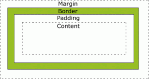
All HTML elements can be considered as boxes. The CSS Box Model is shown in the figure at left.

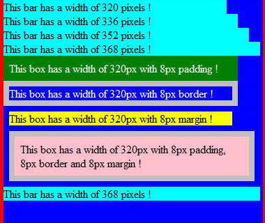
The width and height properties specified for an element with CSS refers only to the content area. To get the full size of the element, you must also add the padding, the border and the margin.
The different parts are :

Firefox

Padding, border and margin are added to the lengths

  • Margin : transparent area around the border
  • Border : a border around the padding and content with a border color
  • Padding : clears an area around the content with the background color of the box
  • Content : where text and images appear

Padding is the inner space of an element, whereas margin is the outer space of an element. Border is in the middle. The following figures shows the three properties for different browsers :

Firefox - IE9 - Chrome - Safari

Firefox-33 * IE-9 * Chrome-39 * Safari-5.1

In CSS, it is possible to specify different margins for different sides :

margin-top:25px;
margin-right:50px;
margin-bottom:75px;
margin-left:100px;

These margins can also be declared as a shorthand property :

margin:25px 50px 75px 100px;

The values are set clockwise, starting for the top. The same is true for padding. The CSS border properties allow you to specify the style, width and color of an element’s border. The border-style values are :

  • none
  • solid
  • dashed
  • double
  • groove
  • ridge
  • outset

None of the other border properties will have any effect unless the border-style property is set! The border width can be specified in pixels (px) or with the three pre-defined values: thin, medium, or thick.

The shorthand code to set the border is :

border:5px solid red;

The order of the values are : border-width, border-style, border-color.

The following list provides links to websites with additional informations about the CSS Box Model and related topics :

Advanced stuff about CSS selectors

Last update : June 24, 2014

CSS selectors are made up of a pattern that is matched against all elements in the document tree, it’s the part that comes before the opening curly brace. The selector types are :

  • Universal : *  (Matches any element)
  • Type :  p  (Matches  element p)
  • Class :  .info (Matches any element whose class attribute contains the value info)
  • ID : #temp (Matches any element with an id equal to temp)
  • Descendant : p b (Matches any b element that is a descendant of an p element)
  • Child : p > b (Matches any b element that is a child of an p element)
  • Adjacent : p + b (Matches any b element immediately preceded by a sibling element p)
  • Attribute : p[att condition] (Matches any p element whose att attribute is compliant to the condition)
  • Pseudo-Class : p:action (Matches p during certain  actions; pseudo-classes are first-child, link, visited, active, hover, focus, lang(cc))
  • Pseudo-Element : p:content (Matches p for certain contents; pseudo-elements are first-line, first-letter, before, after)

CSS Selectors can be grouped and combined :

  • Multiple class selectors :p.info.error {color:#900;font-weight:bold;}(Matches p elements which have both “info” and “error” in their list of class names)
  • Descendant selectors :div#temp li p.info { color:#f00; }(Matches all p elements with a class name of “info” that are contained by an li element that is contained by a div element with the id “temp”)
  • Child selectors :p > strong { color:red }(Matches all strong elements that are children of a p element)
  • Adjacent siblings selectors :p + p { color:green }(Matches an element p which is the next sibling p to the first element)
  • Grouping :#my1, #my2,  #my3 {color:blue}(Matches all elements with the id’s my1, my2 and my3)
  • Attributes selectors :p[lang|=en] { color:yellow }(Matches all elements whose lang attribute starts with “en”)

:before and :after

The :before and :after pseudo-elements can be used to insert generated content before or after an element’s content.

3 digit color hex codes:

The 3 digit only hex codes are shorthand for the codes that have the numbers repeated in pairs.

#06C = #0066CC

z-index:

The z-index property specifies the stack order of an element. An element with greater stack order is always in front of an element with a lower stack order. z-index only works on positioned elements (position:absolute, position:relative, or position:fixed). An element with a negative value is displayed behind any with an undefined or positive z-index value in the same stacking context.

Some useful links about CSS are :

Internet Explorer Conditional Comments

last update : 17 Januray 2012

Many web designers use browser detection techniques to ensure that their sites display properly when viewed with specific browsers. Often Internet Explorer prior to version 9 is focused by developers because of bugs or lack of support of new css features. The most common way to detect Internet Explorer is to use client-side scripting to parse the user-agent string and extract the version number from the version token. If one is specifically interested in Internet Explorer, conditional comments might be a more effective alternative.

Conditional comments are a simple Internet-Explorer-only feature that Microsoft added to IE5 Windows and later. They provide an easy way to detect what IE browser a visitor is using to serve him different blocks of HTML.

There are two types of conditional comment: downlevel-hidden and downlevel-revealed. Downlevel-hidden comments hide HTML from non-IE browsers and from down-level IE browsers. The basic syntax of a downlevel-hidden conditional comment is :

<!--[if expression]> HTML <![endif]-->

expression can contain a number of different operators and values.

The downlevel-revealed conditional comment enables you to include content in browsers that do not recognize conditional comments. The basic syntax is :

<![if expression]> HTML <![endif]>

Conditional comments are usually used to load specific css or javascript files.

Conditional comments produce valid W3C code.

More informations about these topics :

Viewports for mobile devices and tablet PC’s : a pixel is not a pixel

Last update : June 24, 2014

Designing a webpage which looks good on desktop PC’s, mobile devices and tablet PC’s is challenging. You have to optimize your content at least for screens that are 320px, 480px, 768px, and 1024px wide. One tool to reach this goal is the viewport meta tag.

The viewport meta tag was introduced by Apple for the iPhone, and it has since been picked up by Microsoft for Windows Mobile, by Nokia for Maemo and by Android. Remember however that the viewport has nothing to do with the device. The viewport is the browser and more precisely the window of the browser. Recently the W3C published a draft of a CSS Device Adaptation based on the viewport meta tag.

The tag is ignored by regular desktop browsers.

<meta name="viewport" content="width=800" />

Mobile Safari presents desktop-sized websites on small screens by rendering to a virtual browser screen that is 980 pixels wide. Opera assumes a page to be 850 pixels wide. Pages on the iPad in portrait mode and on other mobile devices are scaled down.  Pages can be zoomed and panned. Viewport tags tell the Mobile Safari that the website displays properly narrower than 980 pixels. The webpage can be set for other scaling preferences.

Apple suggests to avoid hard-coding a width for the viewport and to use the physical device-width to set the viewport :

<meta name="viewport" content="width=device-width" />

This setting makes one CSS pixel equal to one device pixel. The physical device-width refers to the screen size in portrait mode. One problem is that the content is blowed up if the device is oriented in landscape mode. To avoid blow-up, a maximum scale factor can be applied :

<meta name="viewport" content="width=device-width, maximum-scale=1.0" />

You can add the attribute “user-scalable=no” to disable the pinch-to-zoom feature :

<meta name="viewport" content="width=device-width, user-scalable=no" />

This is useful for preventing accidental zooms and makes web apps feel more app-like, but most users might want to see the content at a larger size.

The complete list of viewport properties for iPad (and iPhone with Retina display) is given below :

  • width : 200 – 10.000 ; default : 980
  • height : 223 – 10.000
  • minimum-scale : 0.0 – 10.0 ; default : 0.25
  • maximum scale : 0.0 – 10.0 ; default : 1.6
  • initial-scale : between min and max
  • user-scalable : yes / no ; default : yes

To hide the control-bar which consumes about 60 pixels, the following script can be used :

<body onload="setTimeout(function() { window.scrollTo(0, 1) }, 100);"></body>

To deal with the greatly differing screen sizes, CSS media queries allow to specify completely different stylesheets depending on how large the screen is.

<link media="only screen and (max-device-width: 480px)" href="small.css" type= "text/css" rel="stylesheet">
<link media="only screen and (min-device-width: 481px) and (max-device-width: 1024px)" href="medium.css" type="text/css" rel="stylesheet">
<link media="screen and (min-device-width: 1025px)" href="large.css" type="text/css" rel="stylesheet">

Instead of using separate css-files, the media query can be used inside a single css-file :

@media only screen and (min-device-width: 481px) and (max-device-width: 1024px)
{
styles
}

In fact it’s useful to consider two viewports : one based on device pixels, the other based on CSS pixels. Only at zoom level 100% one CSS pixel is exactly equal to one device pixel.

The iPhone 4’s Retina display has a far larger physical pixel density than previous iPhones. Still, it reports 320px for the device-width media query (as well as JavaScript screen.width) both with and without the meta viewport width=device-width.

A few links about useful tutorials about viewports and other related subjects are listed herafter :

The next list shows links to iPad and iPhone simulators to test the rendering of webpages on these devices :

CSS : clear floats

Elements following a floated element will wrap around the floated element. To disable wrapping, you can apply the “clear” property to these following elements. The standard method is to place a complete “cleared” element last in the container :

<div style="clear:both;"></div>

To clear CSS floats without this extra markup you can use the following techniques :

  • Float the container as well
  • Use overflow: hidden on the container
  • Generate content using the :after CSS pseudo-class

A very detailed tutorial about Floats has been published by Vitaly Friedman, editor-in-chief of the Smashing Magazine.

Other useful tutorials are :

HTML5 : block-level and inline elements

Block-level elements like (<div>, <pre>, <p>, <ul>, <ol>, <li>,… ) take up the entire width of their containing element and the height of the default line-height. They stack up underneath each other, top-to-bottom.

Inline elements like (<img>, <em>, <strong>, <a>, <span>, …) are in-line. They stack up next to each other, left-to-right.

All HTML block-level elements have five spacing properties: height, width, padding, border and margin. In the HTML box-model, the width of padding, border and margin are added to the width of the content area.

Applying float to an element will automatically make it a block-level element.

HTML5 editors

My preferred HTML5 editor is Notepad++. Notepad++ is a free source code editor that supports several languages. Running in the Windows environment, its use is governed by GPL License.

There are other HTML5 editors available. Adobe’s Dreamweaver CS5 is the flagship among the commercial tools.

A list of some other useful HTML5 editors is shown below :

  • Aloha Editor (semantic Rich Text Editor framework written in Javascript with best support of xHTML5)
  • Rendera by Brian P. Hogan